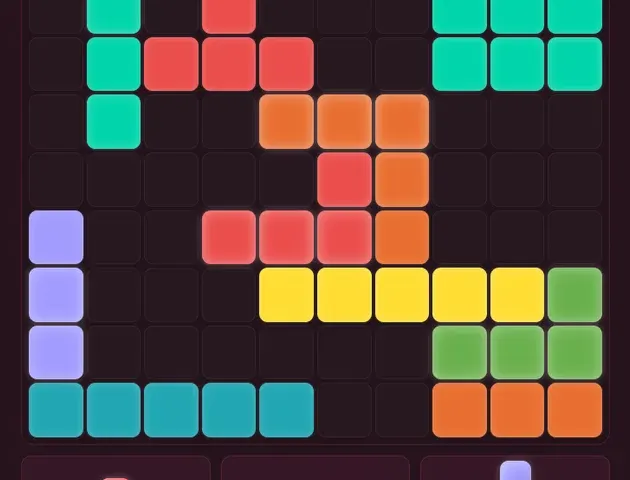
This is an updated edition of the Plokk development case study first published on 20 March 2026. It now focuses on the game and the decisions behind it; the original address redirects here.
Plokk began with a familiar puzzle idea: offer a set of block shapes, let the player place them on a grid, and clear completed rows and columns. The challenge was to make that small loop feel worth returning to.
The browser was a natural starting point. A player can open a link and try a run without committing to a download. That makes the first few moments of the game especially important: the board needs to communicate what is possible, and each placement needs to feel clear.
Start with the rules you can test
The first development work focused on the placement engine: which cells a shape occupies, whether those cells are free, and which rows or columns clear after a move.
Those rules are well-defined enough to test directly. They also form the foundation for every visual flourish. A satisfying animation is no help if the board and the score disagree about what just happened.
AI-assisted development helped with the initial implementation and iteration. The important work was still to review the behavior and try the game repeatedly, especially the placements and endings that were easy to overlook in a happy-path demo.
Game feel is a separate job
Once placing and clearing worked, the question changed from “Does this move work?” to “Does this move feel good?”
Color, motion, sound, and the pacing of feedback all contribute to that answer. The player needs to recognize a successful placement, see what cleared, and understand the space left behind. Feedback should help someone read the board, not compete with it.
The lesson from the original development writeup remains useful: getting functional game logic quickly does not remove the need for playtesting and careful visual decisions.
Give a returning player a fresh reason to play
Plokk’s daily challenge uses a shared seed, giving players a common puzzle rather than unrelated random openings. Global leaderboards give that score chase a place to live.
A daily board also changes how people approach a run. The opening becomes something to consider, compare, and learn from. The game’s daily challenge page explains the player-facing experience in more detail.
The marketing website does not handle those game services. Plokk runs as its own application, with its own player features and support information.
Give Windows players another way in
Plokk is also available through the Microsoft Store. The original writeup described packaging the web app with PWABuilder and preparing its listing artwork and screenshots.
That work was about distribution as well as implementation. A Store listing needs clear descriptions, recognizable screenshots, and support information that matches the actual game. The browser version remains an easy way to try Plokk first.
Keep the website close to the game
This new RatataLabs website puts the games at the center. A game page should make it easy to understand what you will do, see real artwork, and reach the right Play or Store link.
It should also be useful after the first visit. That is why we are publishing player guides alongside development updates, starting with Your first game of Plokk and Make room for your next move.
The studio site can change without replacing the live game. Plokk’s gameplay, accounts, and data remain with Plokk.
Try a run of Plokk and see how much room your next move leaves.